
What's the ideal paint color for your office?
An office is a place where one spends many hours each day working, thinking, and creating. Therefore, it is essential to optimize it to boost productivity and feel good.
And if optimizing an office involves choosing comfortable furniture, it also involves its decoration, especially its color. It is true that this may seem like a trivial detail, but shades have a significant impact on our mood, concentration, and creativity. That is why it is crucial to choose the right colors for your offices.
The impact of colors on concentration and productivity
Colors play a crucial role in our work environment. They can influence our mood, stress levels, and ability to concentrate. Therefore, you must carefully choose the colors you will put on your walls to ensure they have the desired effect.
The meaning and effects of colors
Each color conveys specific symbolism and emotions. For example:
- Blue is often associated with calm, serenity, and trust.
- Green, the color of nature, is known for its soothing and regenerative virtues.
- Red, on the other hand, is a dynamic and energizing color that can encourage productivity. However, it is recommended to use it sparingly as it can also generate agitation.
The role of soothing colors
Some paint colors help relax the mind and reduce tension in the workspace. This is particularly the case with:
- Aqua green,
- Pastel blue,
- Or lilac.
So, do not hesitate to use them to create an atmosphere conducive to concentration and well-being.
The importance of neutral tones for a professional setting
For an office with a professional and timeless look, sober colors such as white, beige, gray, taupe, and black bring a touch of elegant sobriety and create a serious and efficient work environment.
They also have the advantage of easily blending with other colors, offering you numerous decoration possibilities.
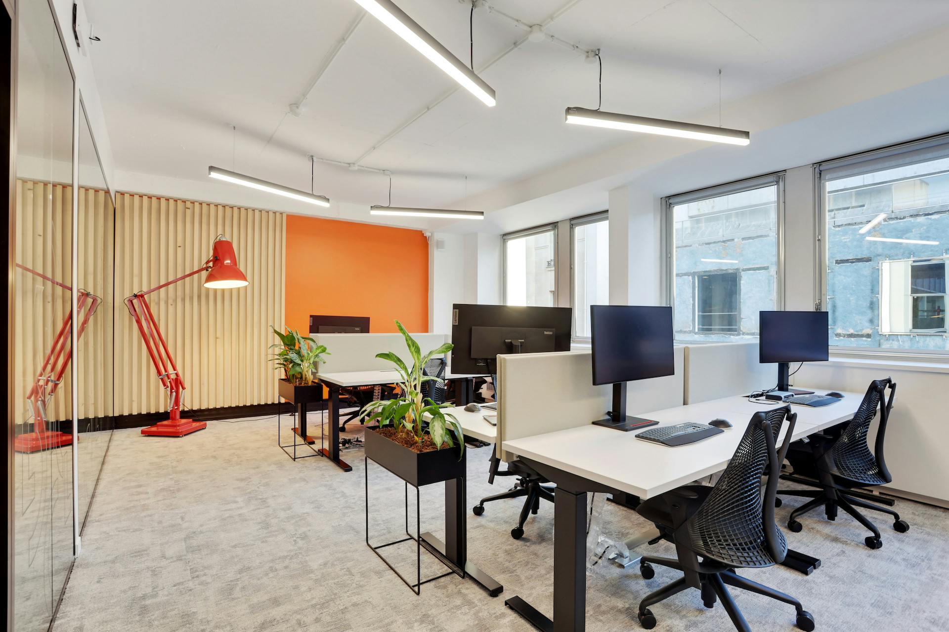
In a coworking space, for example, you can opt for an all-white look to which you can add some touches of bright colors to bring a modern and dynamic spirit.
Well-being in the office: Focus on soft and soothing colors
Choosing soft and soothing colors in an office helps create an environment conducive to the fulfillment and serenity of employees in the company. Discover how to choose shades that promote well-being and relaxation in your workspaces.
The advantages of neutral colors
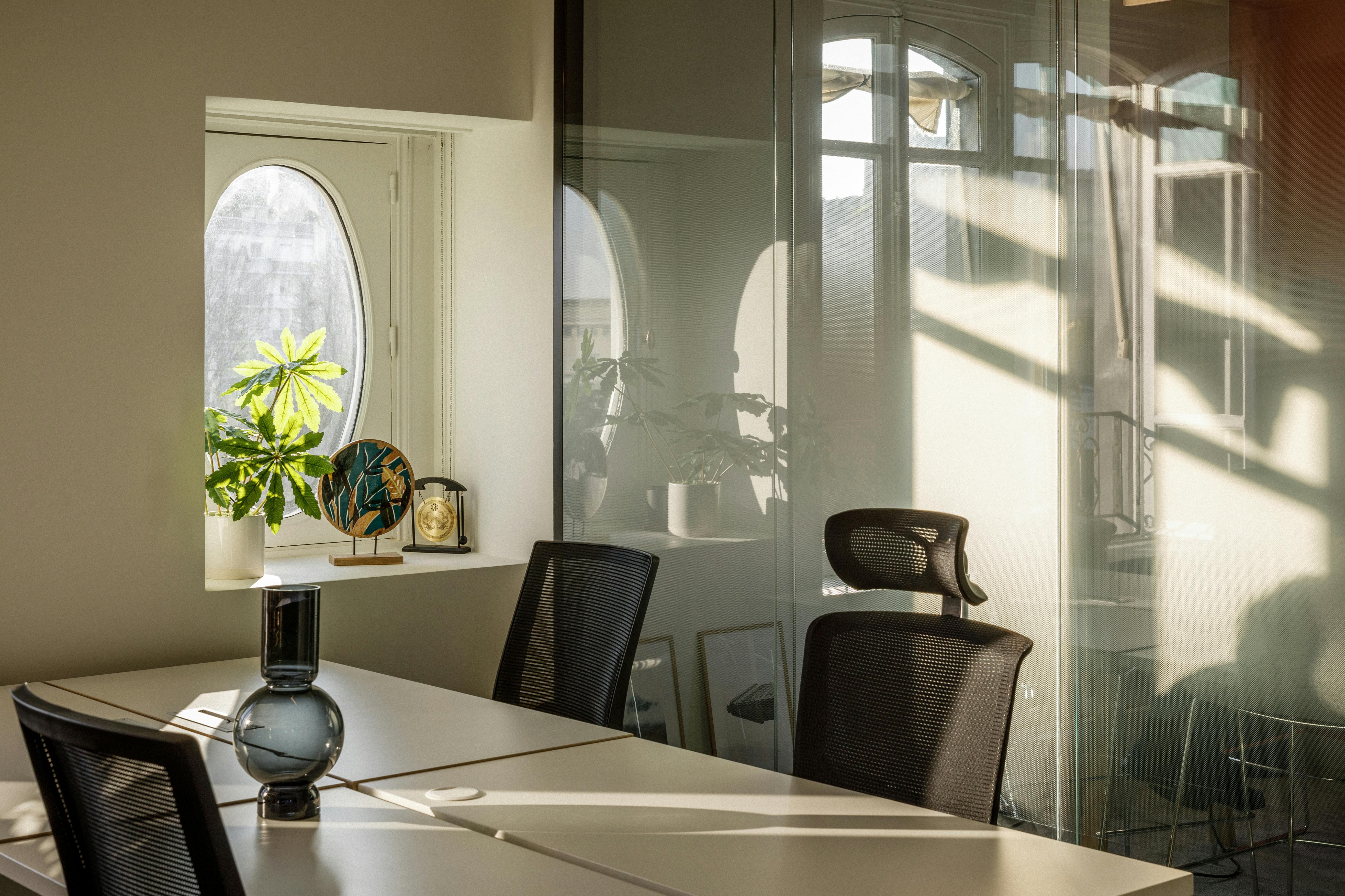
Neutral colors such as beige, light gray, or off-white have many advantages for well-being in the office.
- They bring a calm and distraction-free atmosphere, conducive to concentration.
- They blend easily with touches of brighter colors to energize the space.
- They give an impression of brightness and space, conducive to the well-being and fulfillment of your teams.
The beneficial effect of pastel colors
Pastel colors have soft and powdery tones that make them perfect allies for creating a soothing and caring work environment.
Shades like powder pink, aqua green, or sky blue bring a touch of softness and freshness to the office decoration. They stimulate creativity while promoting relaxation and well-being.
So, do not hesitate to use them on walls, furniture, or accessories to infuse a soft and cozy atmosphere into your workspaces.
Stimulating creativity with dynamic colors
Do you want to encourage innovation and stimulate the inspiration of your employees? Then you can use certain dynamic and energizing colors. These shades, to be used sparingly, bring a dose of vitality and punch conducive to creativity.
The energy of warm colors
Warm colors like orange and yellow are known to stimulate creativity and bring energy into a space.
- Orange encourages communication and exchanges, making it a wise choice for a coworking space or a meeting room, for example.
- Yellow, on the other hand, encourages reflection and boosts morale.
Used on a wall or decorative elements, these tones will subtly energize the office and foster the emergence of new ideas.
Using bright tones sparingly
Bright and vibrant colors like red, fuchsia pink, or apple green can be used to add a touch of zest to an office.
However, it is essential to use them subtly to avoid overloading the space and creating a too hectic atmosphere.
Visually enlarging space: Colors and brightness
In small offices or cramped spaces, the choice of colors can make all the difference in visually enlarging the room and bringing brightness. Let's see how.
Light colors for a spacious effect
Do you want to visually enlarge a small office and give it a feeling of space? Light colors on the walls will then be your best allies.
White is, of course, the essential shade to maximize brightness and give a sense of openness. But if you find white too cold, you can also choose shades of beige or pearl gray that will bring softness and clarity to your workspace.
You can also play with contrasts by painting the ceiling in a lighter tone than the walls to accentuate the ceiling height and give an additional impression of space to your small office.
Color combination for a bright office
The brightness of your office is an essential element to you? Then you will need to opt for a palette of light and harmonious shades that will reflect natural light and bring clarity and freshness to your workspace.
For example, combine a white wall with touches of beige or light gray to create a soft and bright ensemble. You can also introduce pastel shades like aqua green, sky blue, or powder pink, which will bring a soothing touch and increase the sensation of space.
Also, consider taking natural light into account when choosing your color combinations.
If your office is south-facing, prefer slightly more sustained tones that will not be "eaten up" by the sun. Conversely, in a room facing north, opt for softer and brighter tones to compensate for the lack of natural light
Making an office warm and welcoming
Want a warmer and more welcoming office? Then the secret is to focus on soft and pleasant decorative elements and lighting as well as warm colors.
Choosing warm colors
To create a welcoming and warm environment in your office, it is essential to choose suitable colors.
Warm shades like orange and yellow are particularly suitable for bringing a stimulating and energizing atmosphere to your workspace.
Decorative additions and lighting
If colors play an essential role in giving your office a warm and welcoming style, they can also be associated with decorative elements and specific lighting to reinforce the desired atmosphere.
You can, for example:
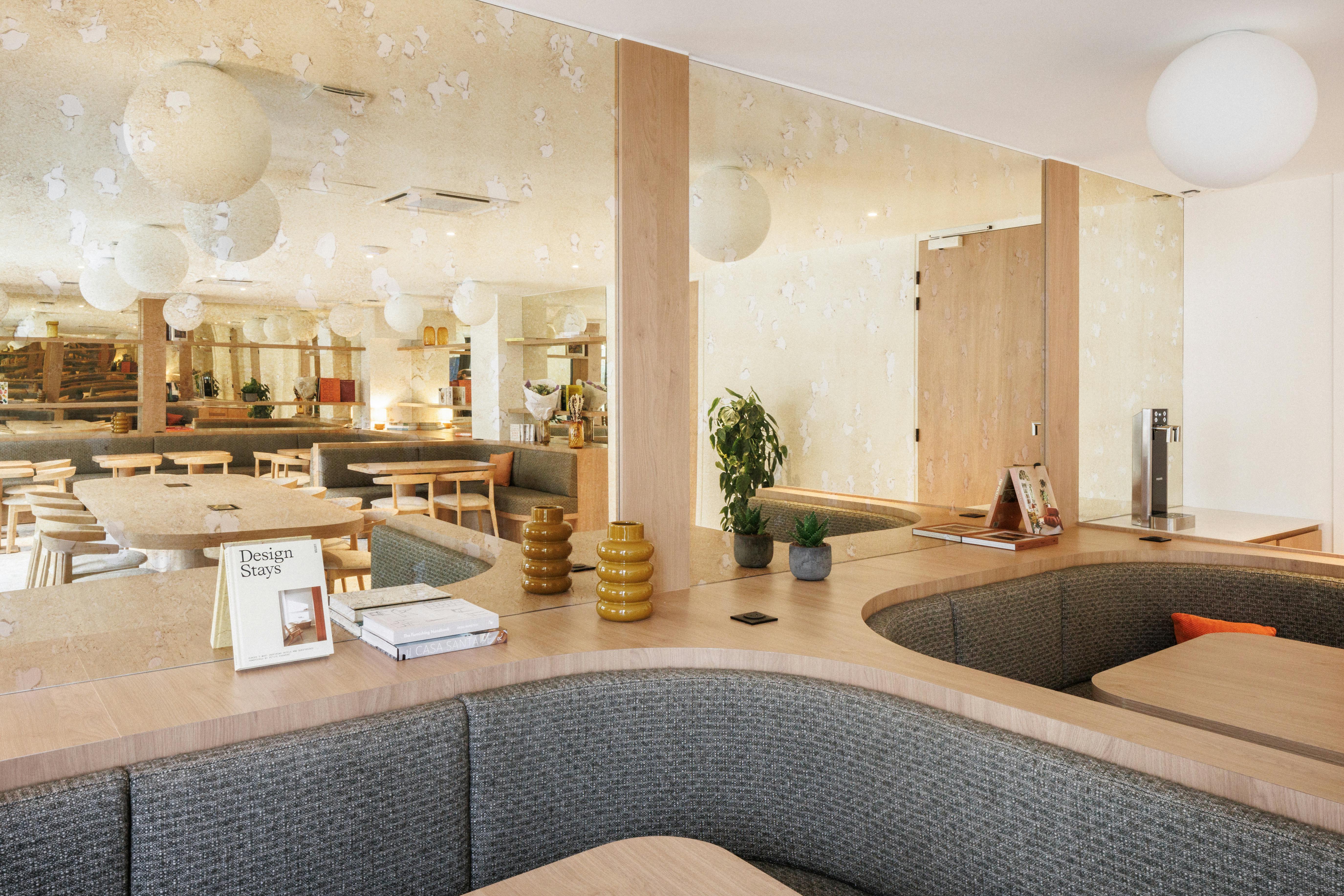
- Incorporate green plants that will bring a touch of nature and freshness to your workspace.
- Opt for frames and posters in bright colors that will energize the whole and create a stimulating atmosphere.
- Integrate ambient lighting with luminous garlands or soft-toned lamps for a cozy atmosphere.
- Add cozy cushions and throws in warm tones like terracotta, ochre, or burgundy.
- Install a plush carpet to bring an additional touch of comfort and delimit the space in a warm way.
Harmoniously combining two colors in an office
Combining several colors is an excellent way to give your office a unique character. However, it is essential to ensure that the chosen shades harmonize well with each other.
Choosing a dominant color and an accent color
A harmonious and balanced office can include several paint colors, but it is essential not to do just anything… If you want to dare the color mix, you will need to be careful to choose a dominant color and an accent color.
- The dominant color will be the one that occupies the largest surface, usually the walls. Prefer a neutral and timeless shade like white, beige, or gray to create a calming and bright base.
- The accent color will be present in small touches to energize the space. You can even use it on furniture or accessories to create stimulating visual counterpoints.
Balance and distribution of colors in space
Finally, it is important to ensure that you balance and distribute your colors in space to create a harmonious and pleasant work environment.
- Start by defining specific areas in your office, such as the workspace, the library, the meeting room, etc.
- Assign a color or chromatic atmosphere to each area to visually delineate them and create a coherent whole.
For example, you can opt for a serene and soothing blue in your workspace to promote concentration, then use a more dynamic hue in your creative corner to stimulate your ideas.
- Make sure to balance your colors in space by avoiding too strong contrasts that could destabilize the harmony of the whole. Use your dominant color mostly, then add subtle touches of your accent shades to rhythm the room and create visual points of interest.
In summary, by judiciously choosing your colors, balancing them evenly, and associating them with suitable decoration and lighting, you design a workspace that reflects you and in which it will be good to live every day. So, dare to use color for your company's premises!"

Contact Us
We find your Perfect fit!

